Like our content?
Get our monthly newsletter and other helpful communications for your job search and career.

- Job Seeker Resources
- |
- Last Updated: May 06, 2022

What a Good Resume Looks Like
Learn how spacing, font, emphasis, and text combine to create nice resume designs.
Ever wondered what a good resume looks like? How to build a great resume layout that’s unique without being over-the-top?
The best resumes are designed with a busy reader in mind. They are easy to read, skim, and navigate. Here are some resume guidelines to help you create a stunning design and catch employers’ interest!
Spacing and Margins
One thing that the most awesome resume layouts have in common is plenty of white space—that is, space on the page that isn’t filled with text or other symbols. Space between sections, previous positions, and even individual bullet points will help your reader follow the document and keep your points separate. Also, decently sized margins (at least 0.5”) will ensure appropriate breaks in the text and prevent hiring managers from getting lost in a lengthy line of text.
Font
A surefire way to get your resume sent to the "no" pile is a curly, fancy font and a wild color scheme. But don’t worry; nice resume designs still have a little personality to them!
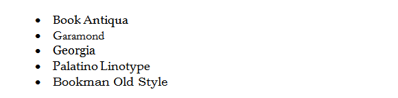
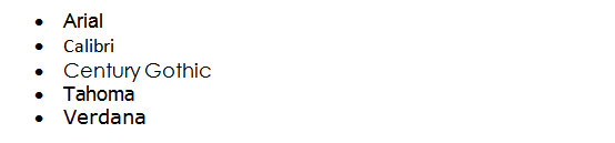
The most accepted resume format guidelines state that you should have no more than two fonts in a single document. Though we, in general, recommend using one font, you may use two if: 1) the typefaces are complementary, and 2) one font is used for headers, while the other is used for all other text.
Here are some suggestions for great resume typefaces:
Serif fonts: These fonts include small finishing lines on the ends of their letters. While Times New Roman does fall into this category, it tends to be overused and is best avoided.
Sans-serif fonts: These fonts do not have any extra lines on the ends of their letters. They are growing increasingly popular for body text.

Adding Emphasis
You are probably familiar with many methods to accentuate important information, such as boldface, different text sizes, all-caps, and italics. What you may not realize, however, is that the key feature easy-to-read resume templates share is how little they use these tactics. If you overdo it, you cloud the waters with too many distractions.
The most accepted resume formats emphasize text only when truly necessary to boost the reader’s ability to navigate the resume. Here are some tips for creating awesome resume layouts that prospective employers can read:
Sizing:
- Your name, at the very top of the first page, should be the largest text in the entire document. Most resume guidelines recommend 18–20 point font.
- Your desired job title, which comes after your contact information, should be the second-largest bit of text (~16–18 point font).
- Section headers should be no more than 2 points larger than your body text.
- Body text size should be large enough that it can be easily read when printed on letter paper (generally 10–12 point, depending on the typeface). Make sure you print out a sample document for yourself before submitting your resume, even with online applications.
Color:
- If you use color, keep it subtle, like a deep burgundy or basic olive.
- Shading is a great alternative to bolding when introducing an entry in the professional experience section that will allow you to thread your color scheme throughout the resume.
- Print two test versions of your resume: one in color, and one gray scale. You want employers to be able to read it no matter what type of printer they own.
Bold and Italics:
- If you choose to bold one section header, you must bold them all.
- When listing previous positions in the professional experience portion, bold either the employer or the job title—never both.
- Italics should be used sparingly, but are good for emphasizing text at the end of a line or section that might otherwise go unnoticed, such as your position within a professional organization or additional, undated experience at the end of the professional experience portion.
Body Text: Short and Sweet
Whoever is reading your resume probably has many more to read, so they don’t have tons of time to wade through long, dense paragraphs to decide whether or not to give you a call. They are more likely to be drawn to nice resume designs with brief descriptions and short accomplishment statements.
On average, paragraphs (the summary and job descriptions) should be a maximum of five lines. Your bulleted achievements should be as concise and hard-hitting as possible—preferably one to two lines each, and the list should comprise no more than five or six points in a row.
Find your dream job on iHire.
Most Important: Consistency
The essence of what a good resume looks like can be described in one word: consistency. Left/right and top/bottom margins should be the same. Use the same alignment (left or center) for your name, job title, and section headers. All body text must be the same size and typeface.
If you redesign one portion, make sure you change all other matching text. Even if you’re tweaking the spacing between bullet points to push a couple lines up to the first page, everything must remain consistent.
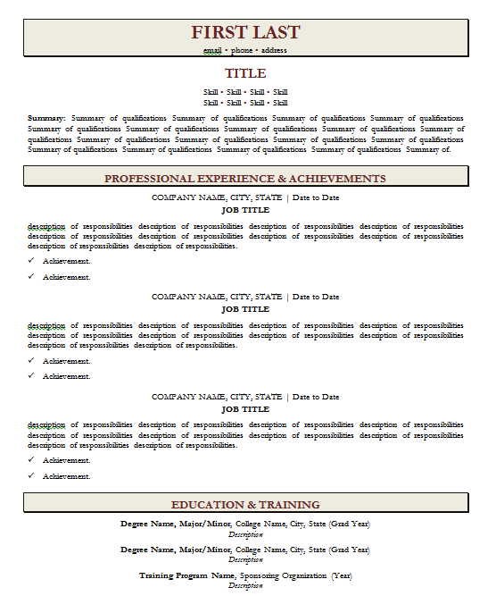
Some of the best resume designs are the simplest. Focus on the resume guidelines listed above, avoid overly fancy styles and layouts, and utilize simple formatting techniques to create nice resume designs and awesome resume layouts. You can even ensure consistent and appealing formatting by using our resume wizard, complete with easy-to-read resume templates like this one:
Sign In or Register to access all articles and insider tips for help in your job search.
Search for Finance Jobs
RELATED JOBS
Overview Stable. Family. Opportunities. Unique. Whether First Citizens Bank has been established...
Corporate Compliance Manager - Quantitative FunctionsThank you for your interest in a career at Regions. At Regions, we believe associates deserve...
Private Wealth Management Wealth AdvisorThank you for your interest in a career at Regions. At Regions, we believe associates deserve...
Governance and Risk Analyst II- TechnologySummary In today's rapidly evolving financial and regulatory landscape, managing IT risk and...
Financial Advisor - Hicksville, NYWork Location: Melville, New York, United States of America Hours: 40 Pay Details: $100,000 -...
RELATED RESOURCES
![Cover Letters Decoded: Live Answers to Your FAQs [Video Webinar]](https://p-gpb8fhd4b9fbh6fy.z01.azurefd.net/cms/dc346ed2-df02-49d6-83f8-852dd6e7b291/364a5d8d-d70a-42ff-aeda-60e7b3897b56-md.png)
Find the Right Job Faster
- Get personalized job matches sent to your inbox every day
- Connect directly with employers before your competition
- Advance your career with expert advice on interviewing, salary negotiation, and more
We value your privacy